Earning Points Campaigns
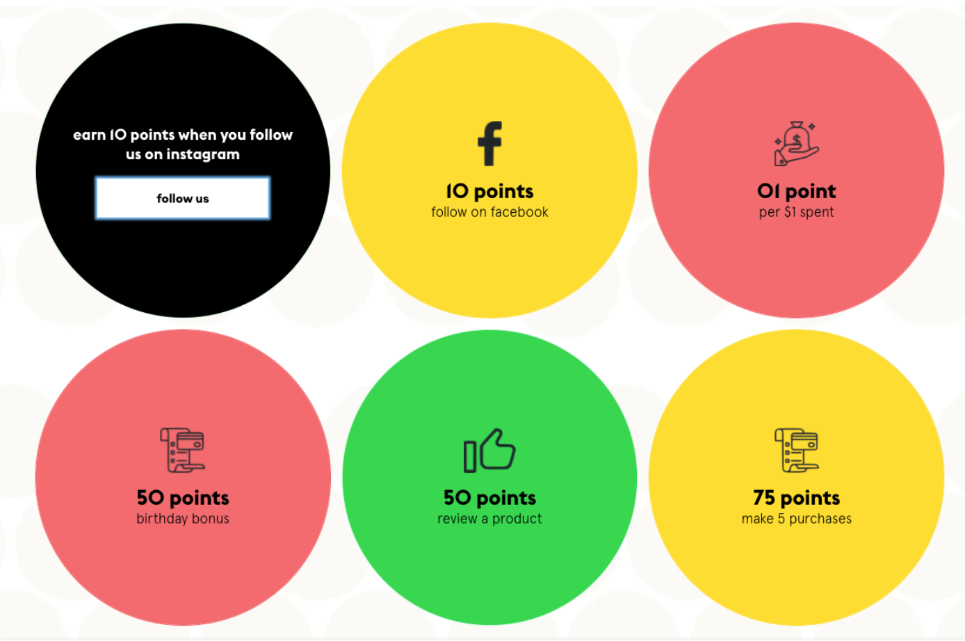
Campaigns are Circles
Set campaign shape to circle instead of square, including mobile (excluding modal in mobile)

Here’s the CSS 
.yotpo-widget-campaign-widget.yotpo-widget-override-css .flexified-child.yotpo-outer-tile,

.yotpo-widget-campaign-widget.yotpo-widget-override-css .yotpo-tile,

.yotpo-widget-campaign-widget.yotpo-widget-override-css .yotpo-container-action-tile,

.yotpo-widget-campaign-widget.yotpo-widget-override-css .yotpo-message-tile,

.yotpo-widget-campaign-widget.yotpo-widget-override-css .yotpo-widget-campaign-widget-container:not(.yotpo-is-mobile) .yotpo-logged-out-tile.yotpo-overlay-tile {

    border-radius: 50%;

}
Refer A Friend
Input box and button on same row
This will cause the form button to appear next to the input field only on desktop.

Here’s the CSS 
.yotpo-widget-referral-widget.yotpo-widget-override-css .yotpo-background:not(.yotpo-is-mobile) .yotpo-referral-widget-form { flex-direction: row; align-items: flex-end; } .yotpo-widget-referral-widget.yotpo-widget-override-css .yotpo-background:not(.yotpo-is-mobile) .yotpo-inputs-container { width: 70%; } .yotpo-widget-referral-widget.yotpo-widget-override-css .yotpo-background:not(.yotpo-is-mobile) .yotpo-action-button-widget { margin-top: 0; width: 25%; } .yotpo-widget-referral-widget.yotpo-widget-override-css .yotpo-background:not(.yotpo-is-mobile) .yotpo-button-style { width: 100% !important; } .yotpo-widget-referral-widget.yotpo-widget-override-css .yotpo-background:not(.yotpo-is-mobile) .yotpo-go-back-button { width: 100%; margin: 0 auto; }
VIP Tiers
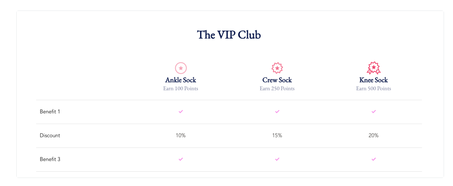
Table Layout - Replace check with text
In case there should be text instead of just a check mark in one of the table cells, we can replace it using CSS nth-child. The first number is the column and the second number is the row.

Here’s the CSS 
.yotpo-grid-vip-tier-container.yotpo-vip-tiers-grid-column:nth-child(2) .yotpo-vip-tiers-grid-benefit-status:nth-child(3) p svg { display: none; } .yotpo-grid-vip-tier-container.yotpo-vip-tiers-grid-column:nth-child(2) .yotpo-vip-tiers-grid-benefit-status:nth-child(3) p:after { content: "10%"; } .yotpo-grid-vip-tier-container.yotpo-vip-tiers-grid-column:nth-child(3) .yotpo-vip-tiers-grid-benefit-status:nth-child(3) p svg { display: none; } .yotpo-grid-vip-tier-container.yotpo-vip-tiers-grid-column:nth-child(3) .yotpo-vip-tiers-grid-benefit-status:nth-child(3) p:after { content: "15%"; } .yotpo-grid-vip-tier-container.yotpo-vip-tiers-grid-column:nth-child(4) .yotpo-vip-tiers-grid-benefit-status:nth-child(3) p svg { display: none; } .yotpo-grid-vip-tier-container.yotpo-vip-tiers-grid-column:nth-child(4) .yotpo-vip-tiers-grid-benefit-status:nth-child(3) p:after { content: "20%"; } /*MOBILE*/ .VueCarousel-slide:nth-child(1) .yotpo-vip-tiers-grid-benefit-status:nth-child(3) p svg { display: none; } .VueCarousel-slide:nth-child(1) .yotpo-vip-tiers-grid-benefit-status:nth-child(3) p:after { content: "10%"; } .VueCarousel-slide:nth-child(2) .yotpo-vip-tiers-grid-benefit-status:nth-child(3) p svg { display: none; } .VueCarousel-slide:nth-child(2) .yotpo-vip-tiers-grid-benefit-status:nth-child(3) p:after { content: "15%"; } .VueCarousel-slide:nth-child(3) .yotpo-vip-tiers-grid-benefit-status:nth-child(3) p svg { display: none; } .VueCarousel-slide:nth-child(3) .yotpo-vip-tiers-grid-benefit-status:nth-child(3) p:after { content: "20%"; }
Welcome Banner Module
Text on top of image on mobile
By default on mobile the text appears below the banner image. Use the following CSS to get it to appear on the image (image height might need to be adjusted as well).

Here’s the CSS 
.yotpo-widget-hero-section.yotpo-widget-override-css .yotpo-text-on-background.yotpo-is-mobile .yotpo-text-container { position: relative; } .yotpo-widget-hero-section.yotpo-widget-override-css .yotpo-text-on-background.yotpo-is-mobile .yotpo-text-and-buttons { position: absolute; top: 0; bottom: 0; left: 0; right: 0; display: flex; flex-direction: column; justify-content: center; } .yotpo-widget-hero-section.yotpo-widget-override-css .yotpo-text-on-background.yotpo-is-mobile { min-height: unset; }
